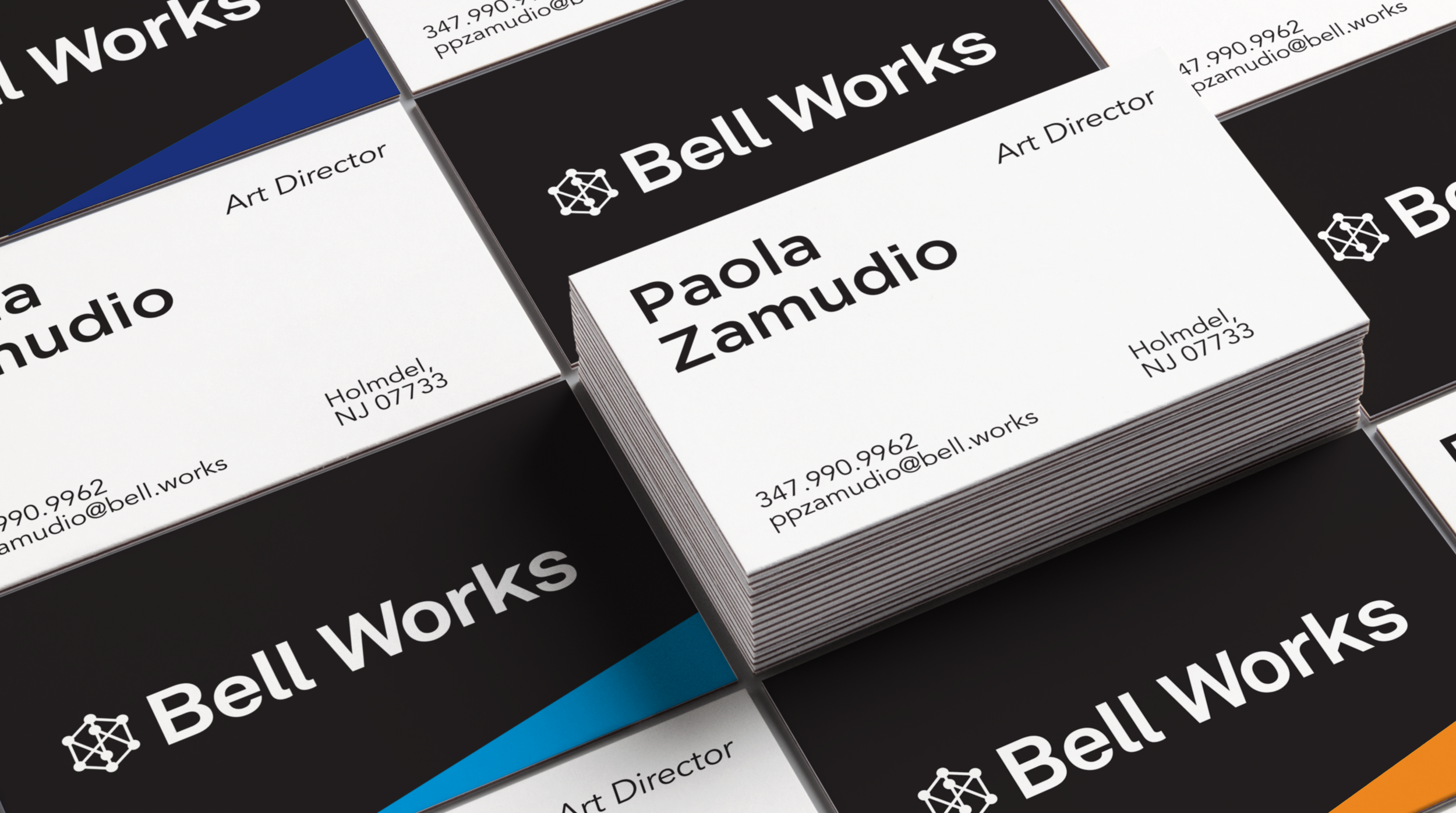
Bell Works
Branding, Strategy, Print Collateral,
Digital Assets, Way finding
Art Direction: NPZ Style + Decor
Photo Credit: Evergreen Media
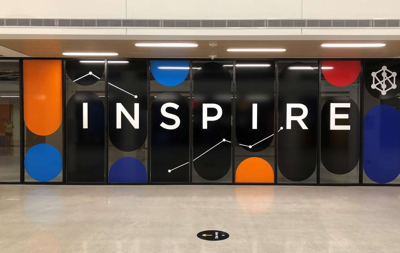
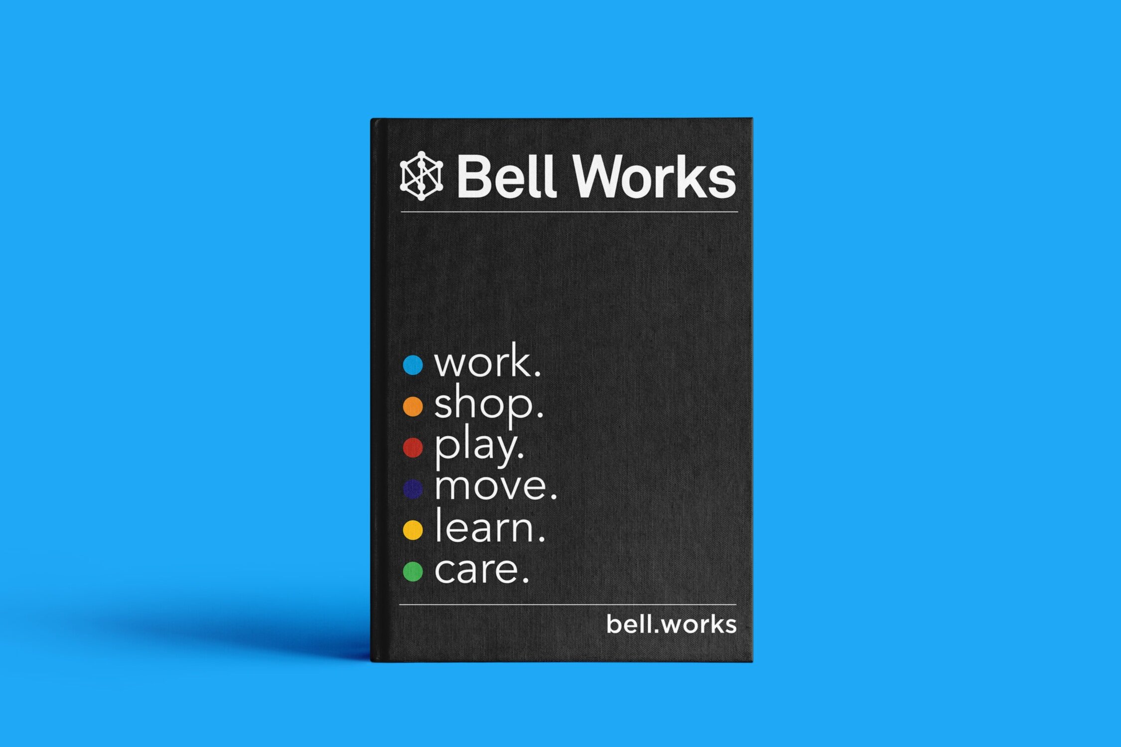
Enforce and stretch Bell Works existing visual identity, merging an illustrious past with a contemporary approach to business.
![bell-labs-archpaper-04[1] (3).jpg](https://images.squarespace-cdn.com/content/v1/5f39c418d478cb54ce8bdd47/1621254742066-6Z4JCX5HH9856YCDSKM3/bell-labs-archpaper-04%5B1%5D+%283%29.jpg)
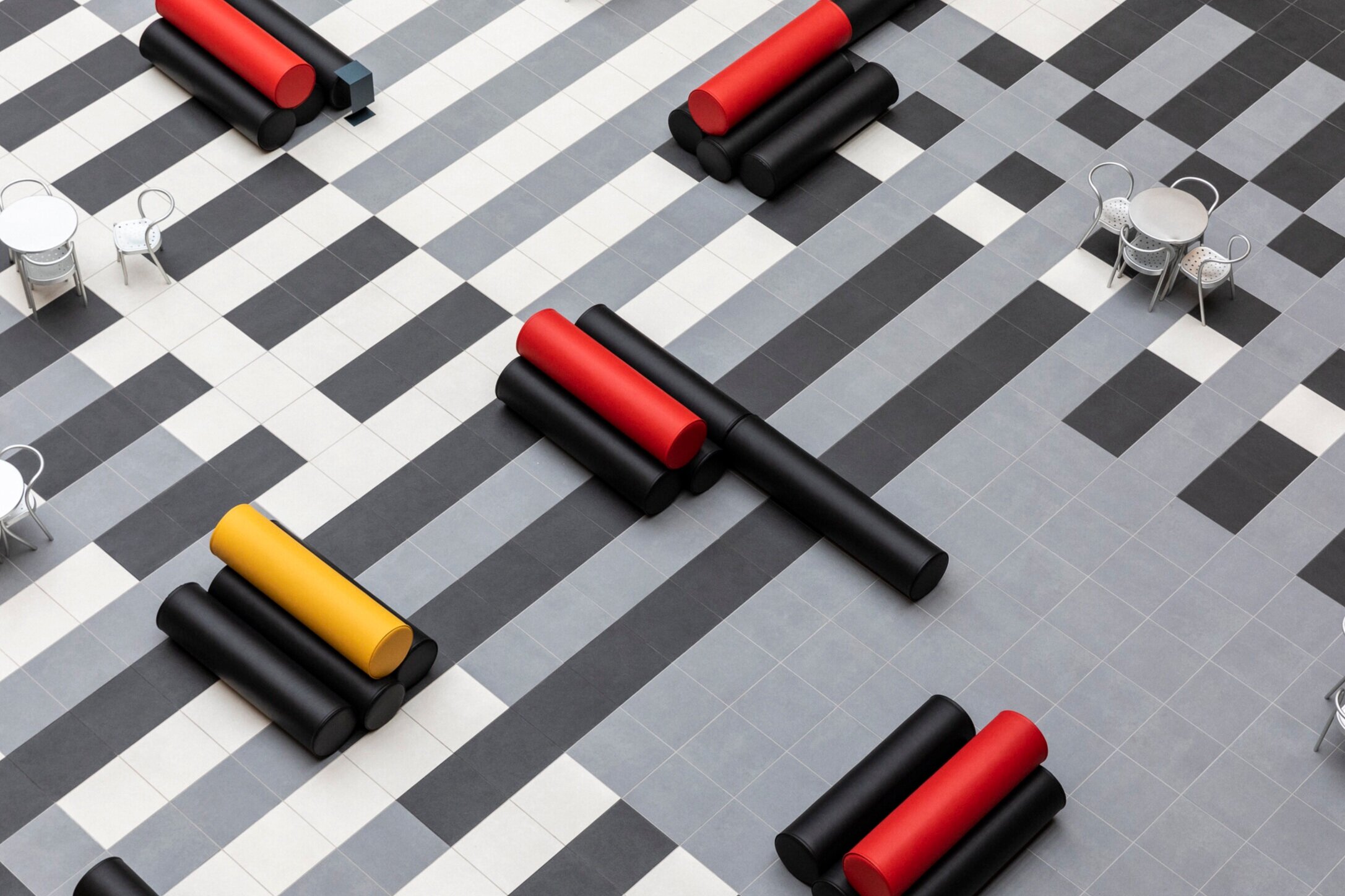
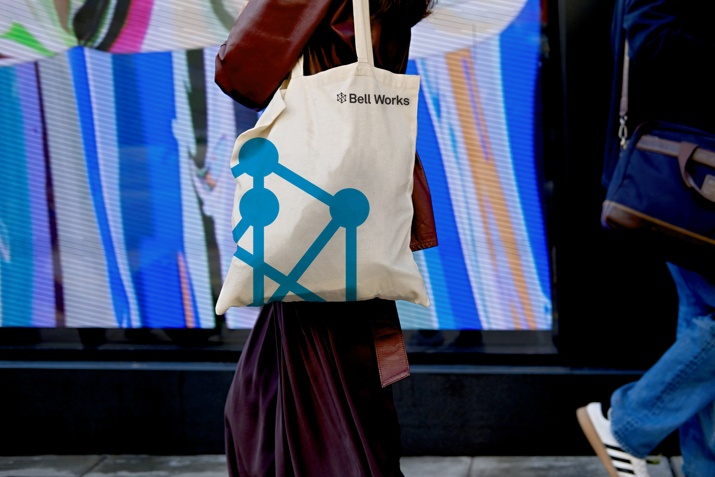
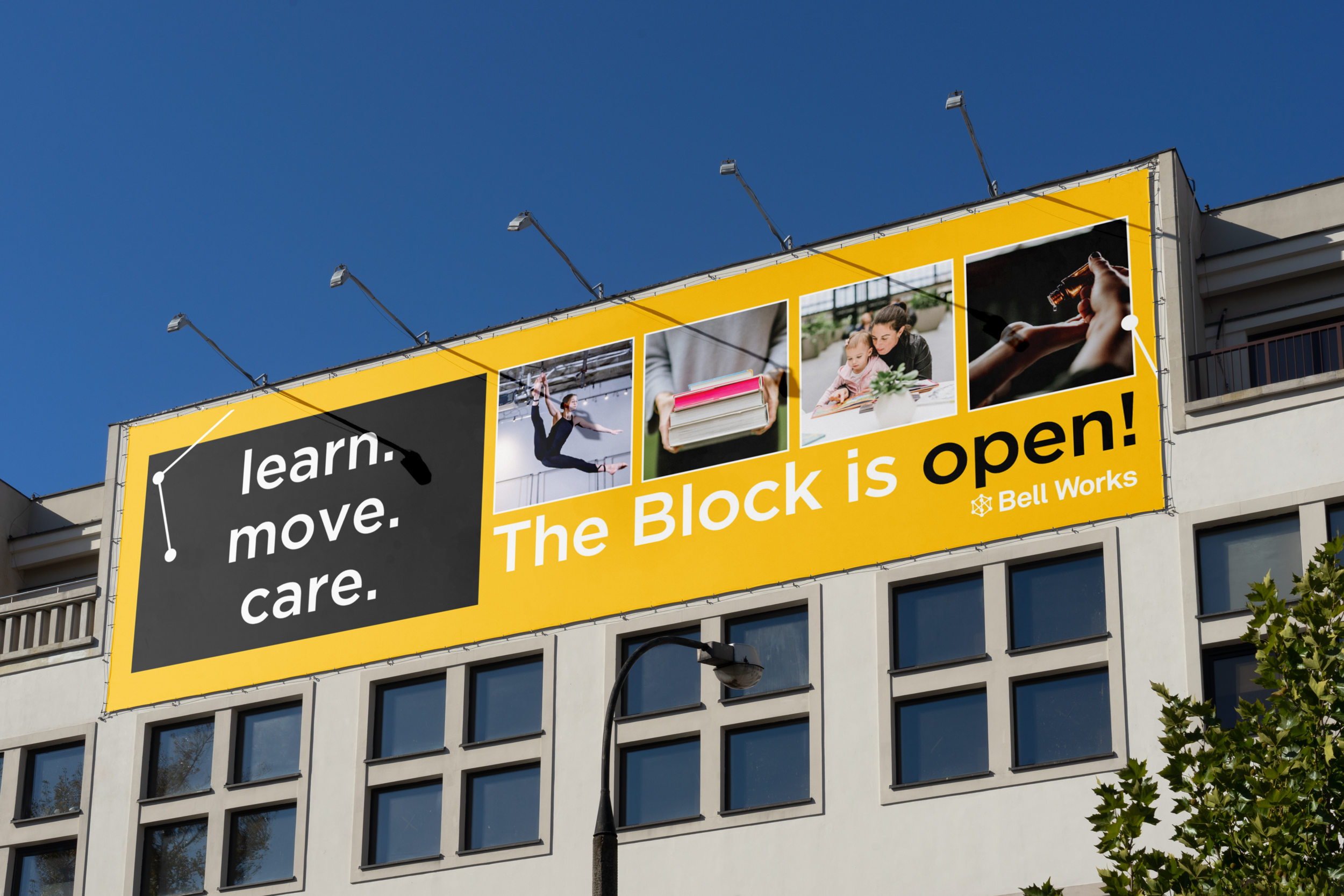
The new extended brand identity leverages the lines, curves and perspective of the iconic Bell Works architecture.

By including new elements such as bold color blocks, connected dots, and architecture shots we allowed the system to be more playful and resonate more with our customers.


Approach
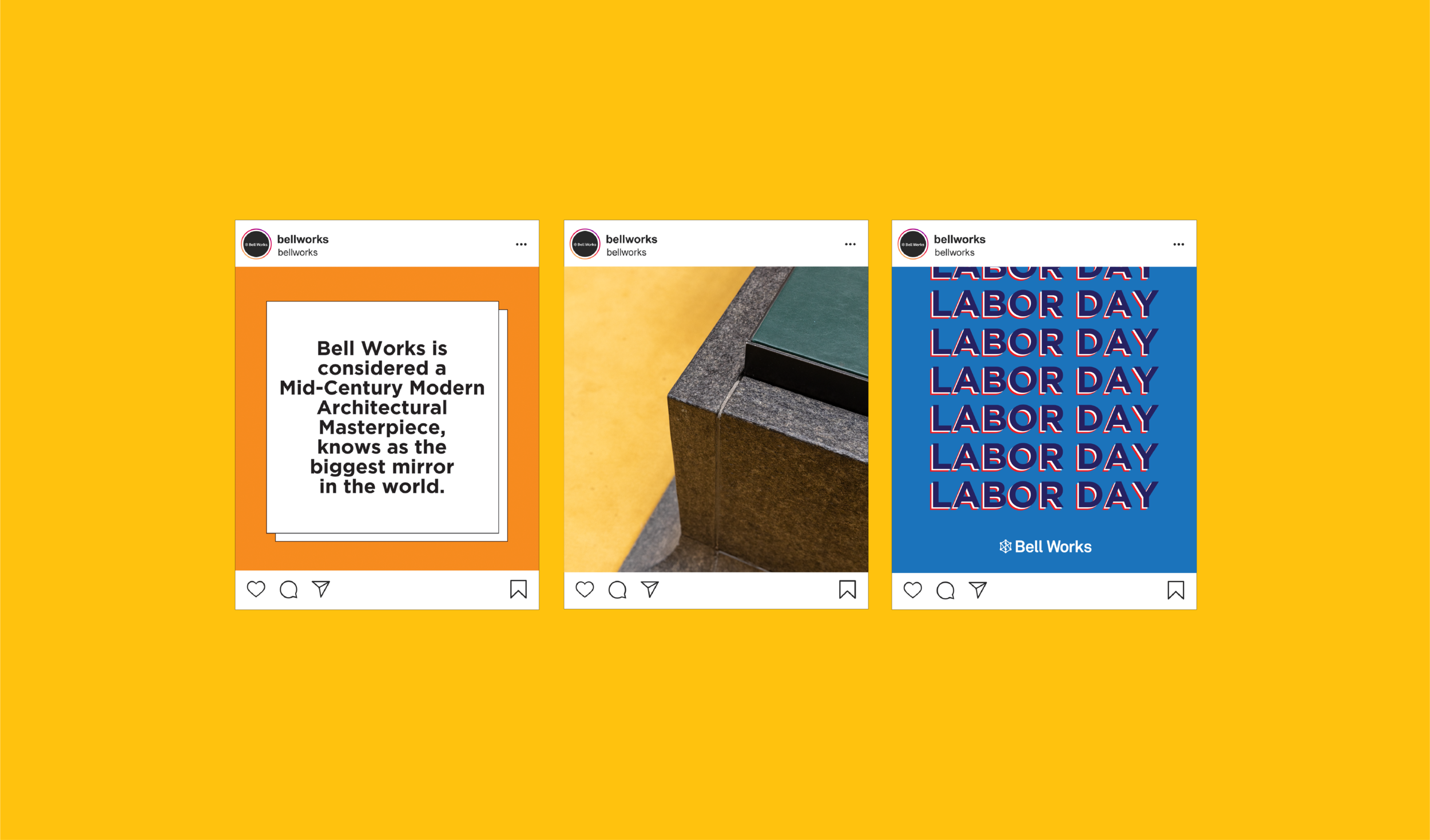
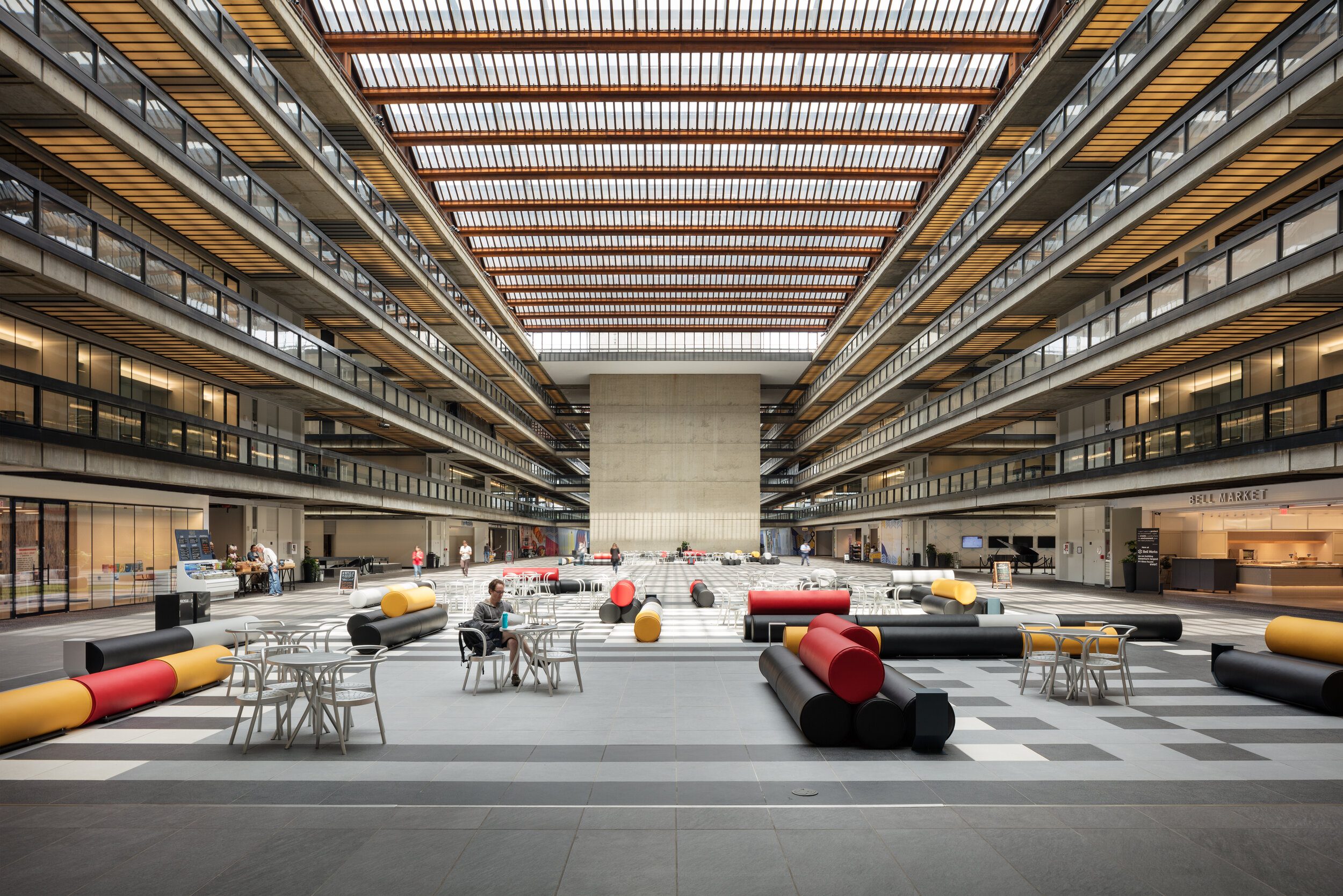
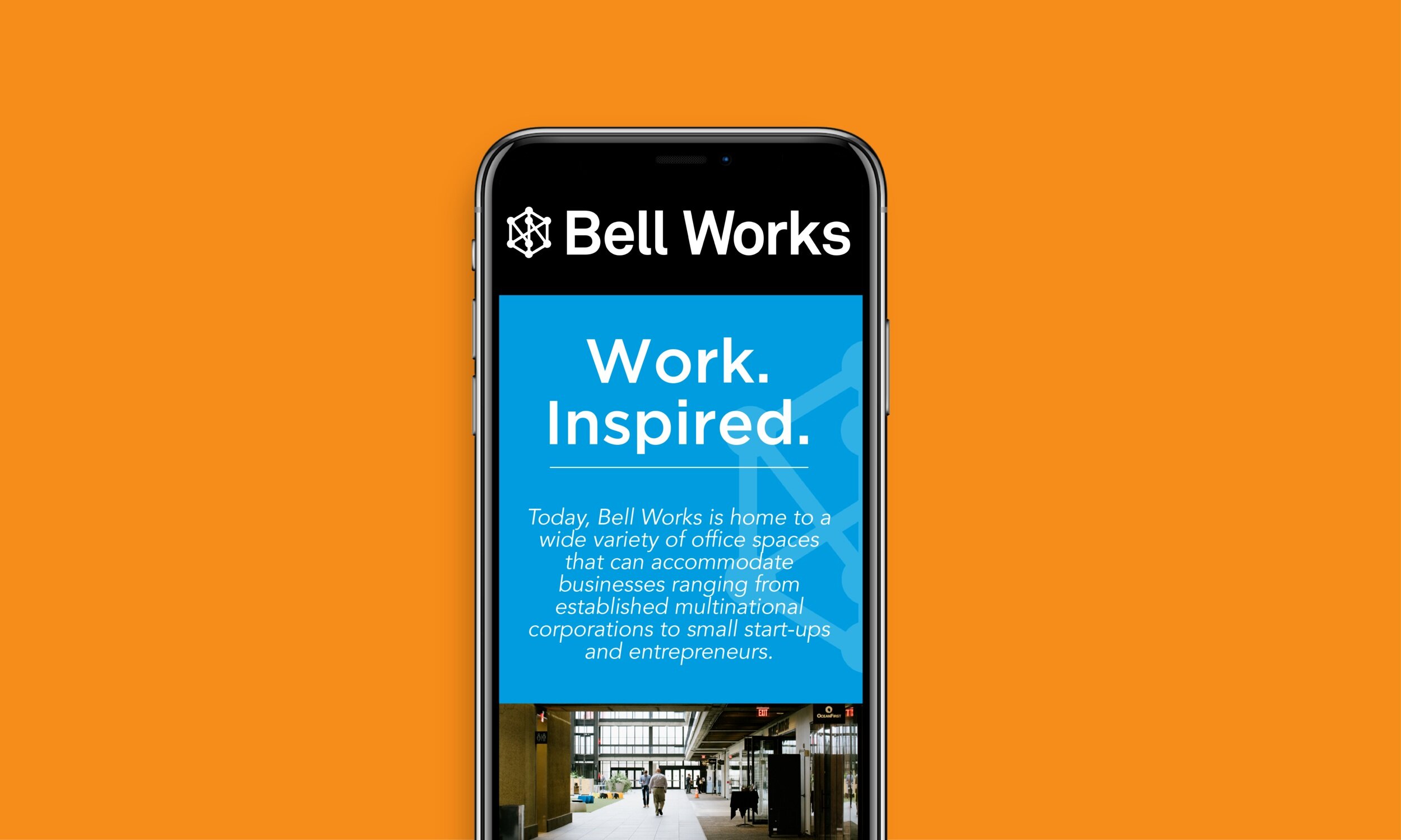
Bell Works is the reimagination of the historic former Bell Labs building in Holmdel, N.J designed in 1958 by renowned modernist architect Eero Saarinnen.
Today, the space offers charming, unique, and inspiring spaces for co-working, events, food, and drinks. Under the direction of Paola Zamudio and her team, I was appointed to stretch the existing visual brand identity in line with her creative vision.
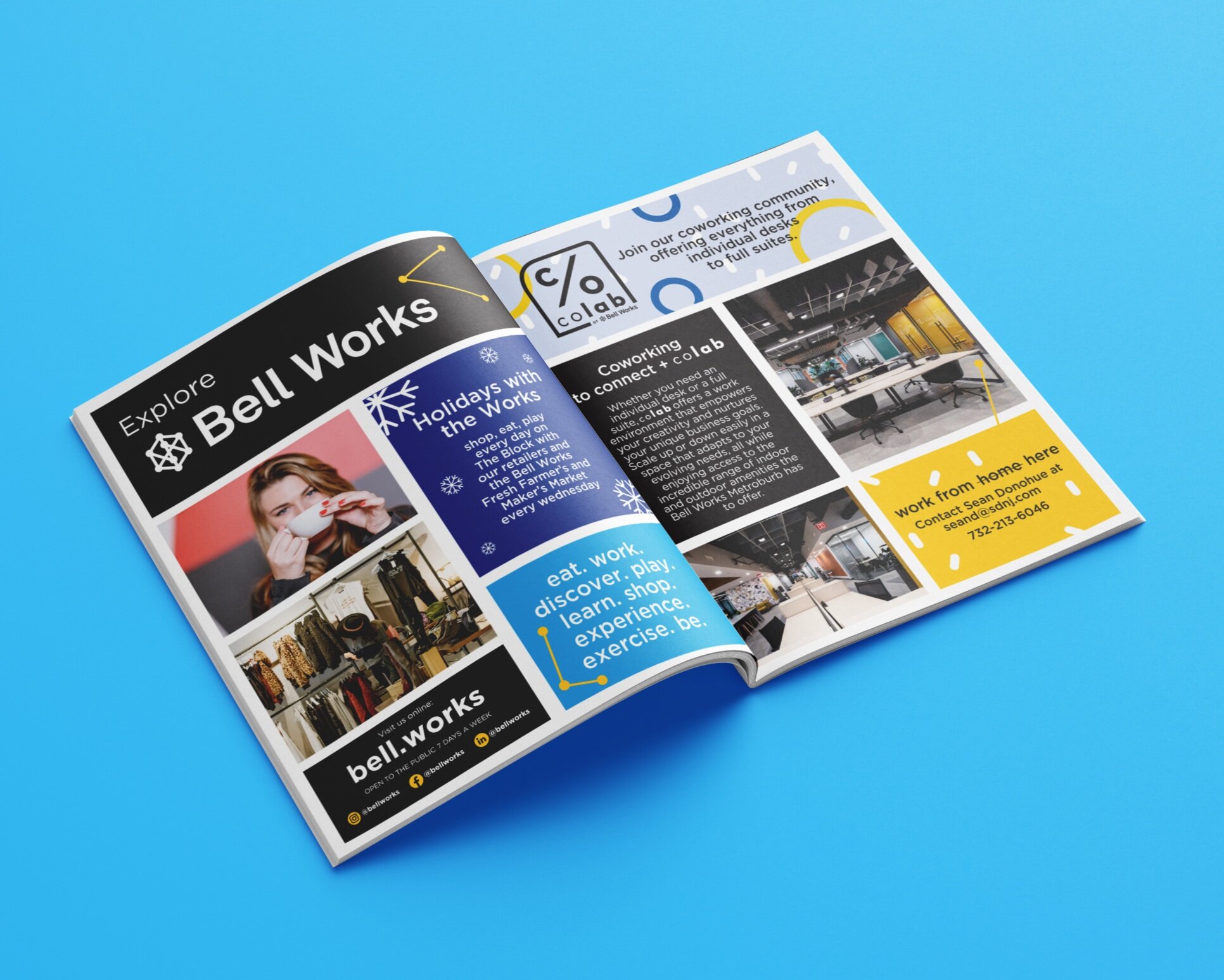
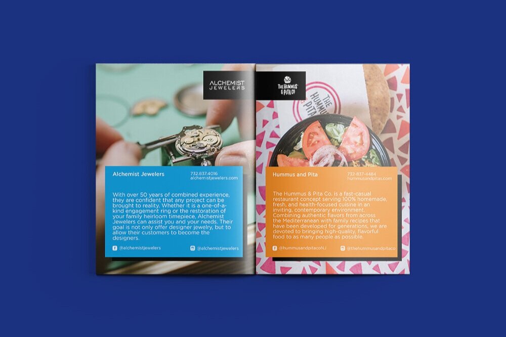
My work ranges from elevating the brand, designing visual communication materials (both online & offline), social media strategy, spatial implementations, and branded products.